01
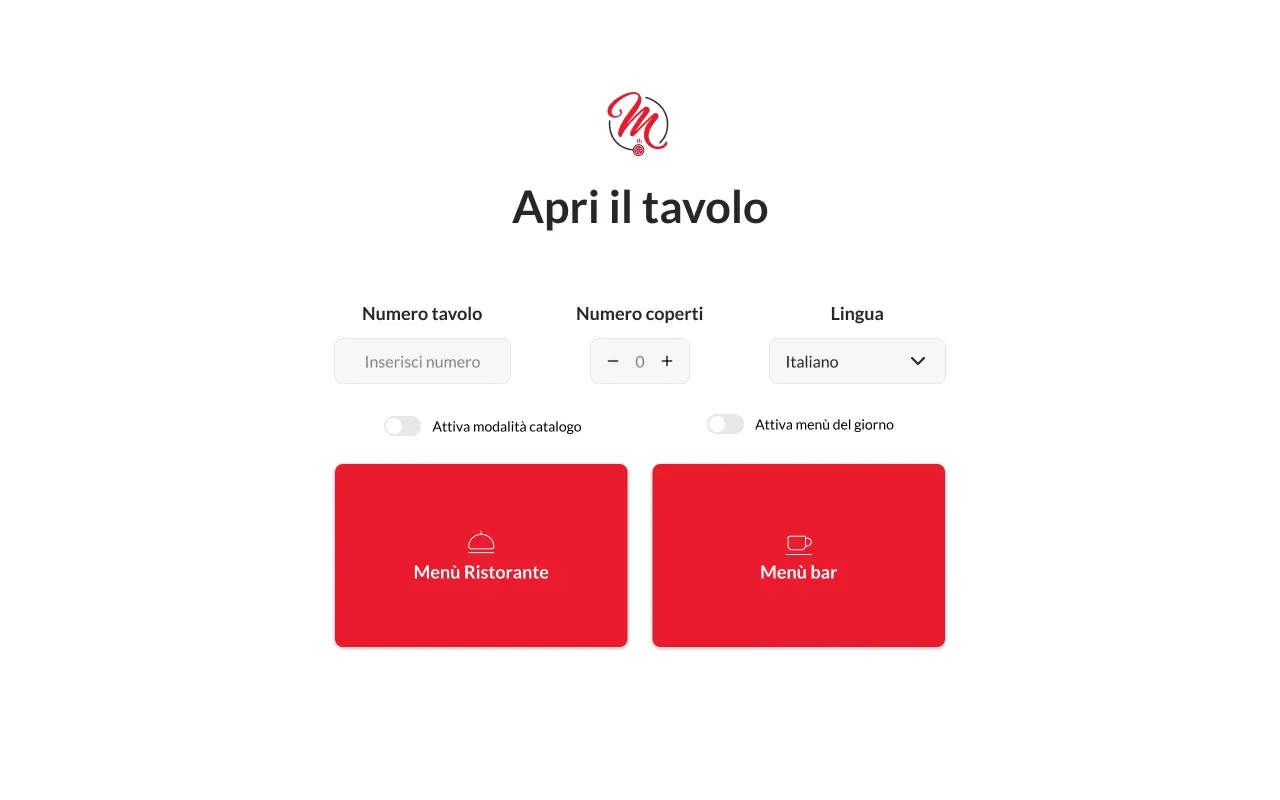
Open the table.
The waiter enters the table number, covers and language, then opens the restaurant or bar menu. This is also where the daily menu and browse-only catalogue mode are switched on.

Services
Table ordering and delivery apps2025
A pizzeria in Mestre since 2006. Two apps we designed: one on the table, one on the phone.
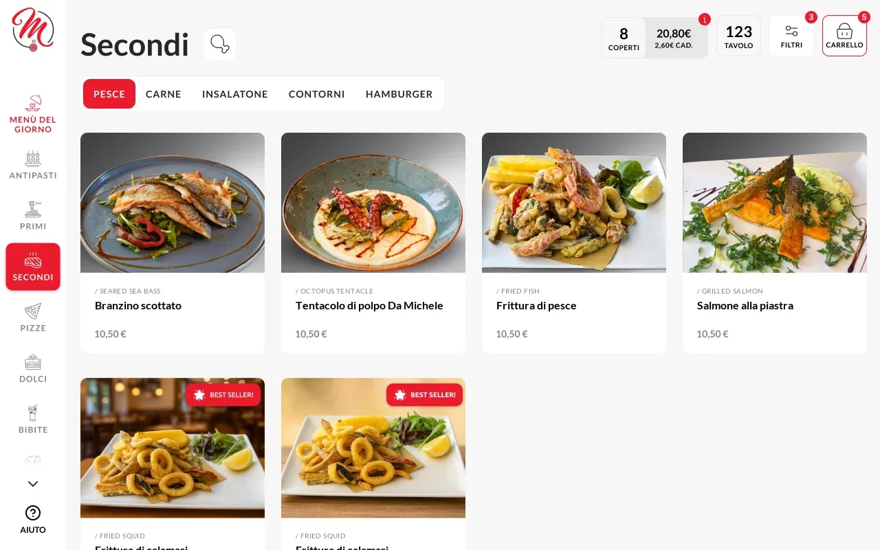
The tablet on the table opens the menu in the guest’s language, and every dish arrives in the course they choose. The phone app brings the same menu home, with points and reviews.
Da Michele is a pizzeria in Mestre, near Venice, opened in 2006: today it has a restaurant on Via Cappuccina and three takeaway and delivery pizzerias. The menu has more than thirty categories across kitchen and bar, and the restaurant also hosts tour groups. Automativo, the agency that ran the project, asked us to design two apps: a tablet menu for ordering from the table and an app for ordering delivery or collection.
More than thirty categories across kitchen and bar, from pizzas to cocktails: on the tablet each had to stay one tap away.
Tour groups and foreign guests: the language is chosen when the table is opened, with flags instead of words.
The fourteen legally required allergens, plus vegetarian, vegan and spicy: guests with an intolerance filter the menu instead of asking dish by dish.
Opening the table, payment and sold-out items go through the waiter, in an area reserved for staff.
On behalf of Automativo we did the UI and UX for two apps in Figma: wireframes, the design of every screen and components ready for development, which another team carried out.
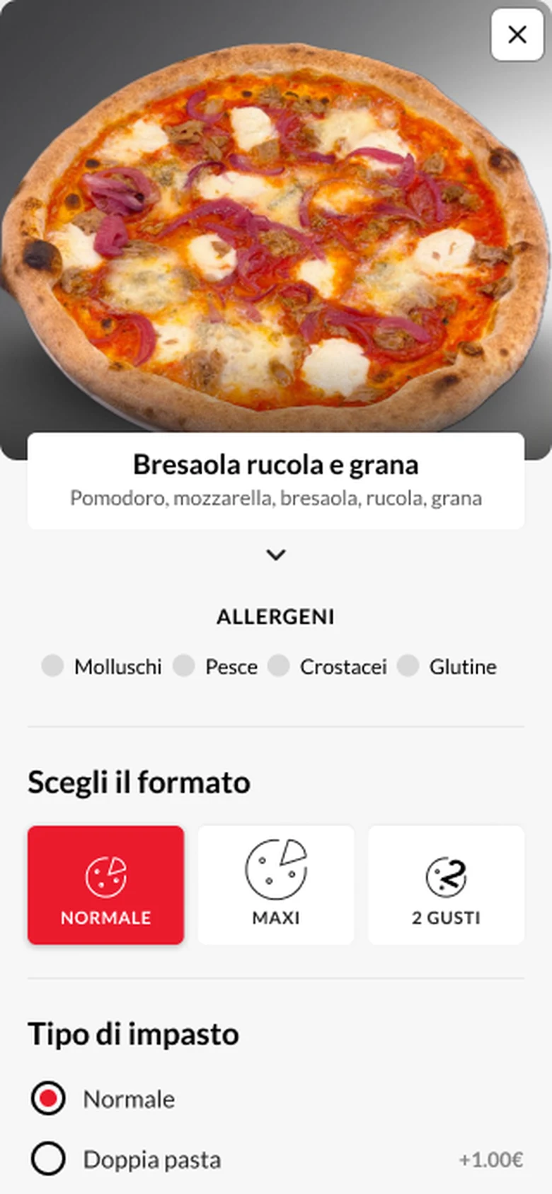
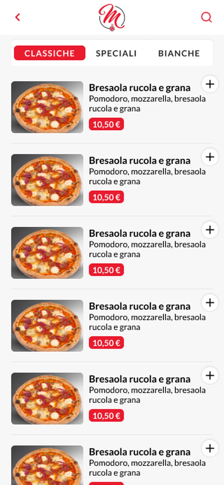
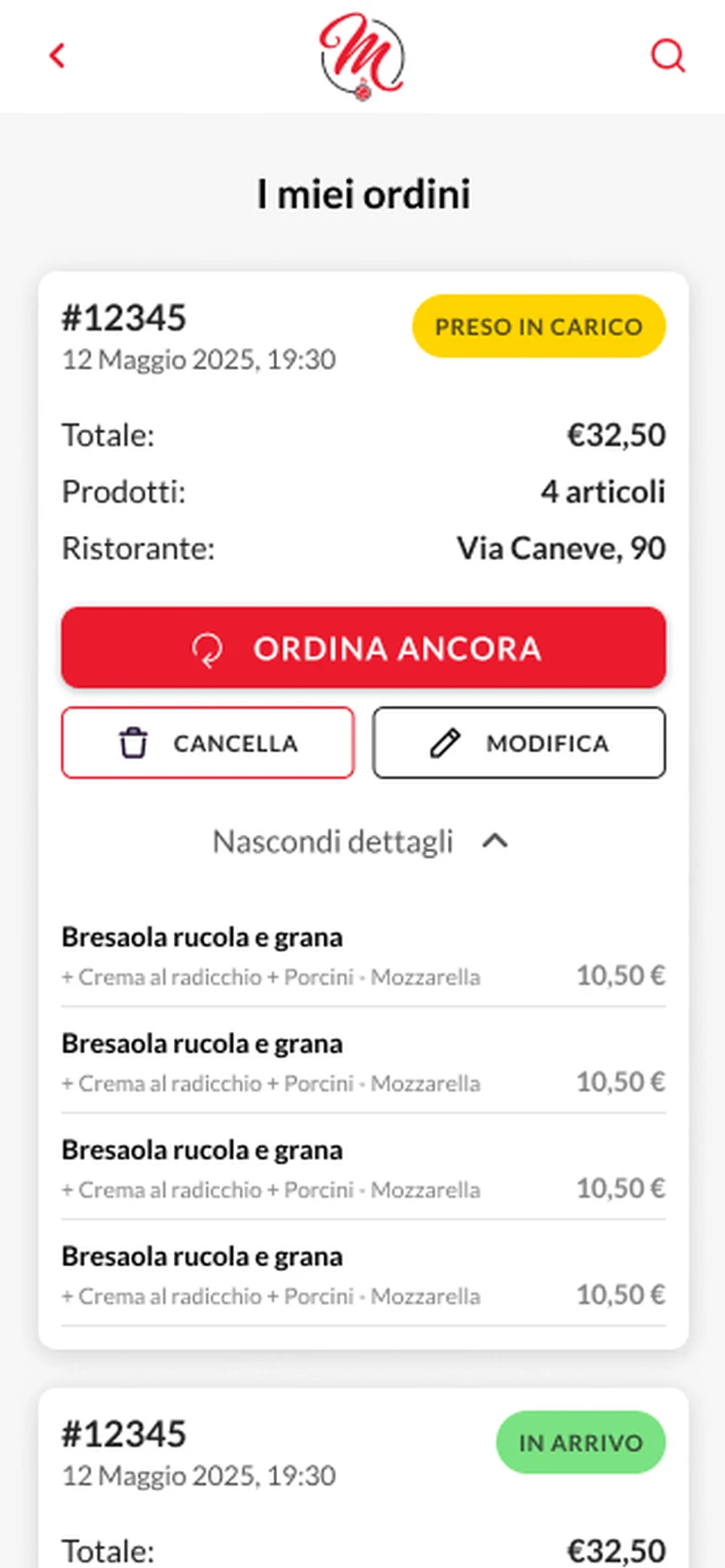
On the tablet, the waiter opens the table with its number, covers and language; guests browse the menu by category, filter by ingredients and allergens and choose which course each dish arrives in. On the phone, you pick delivery or collection, build your pizza (size, dough, toppings) and collect points.
The waiter enters the table number, covers and language, then opens the restaurant or bar menu. This is also where the daily menu and browse-only catalogue mode are switched on.
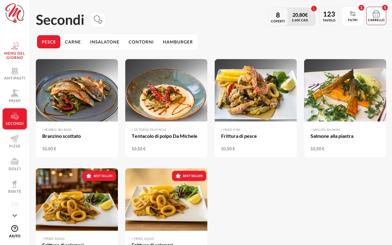
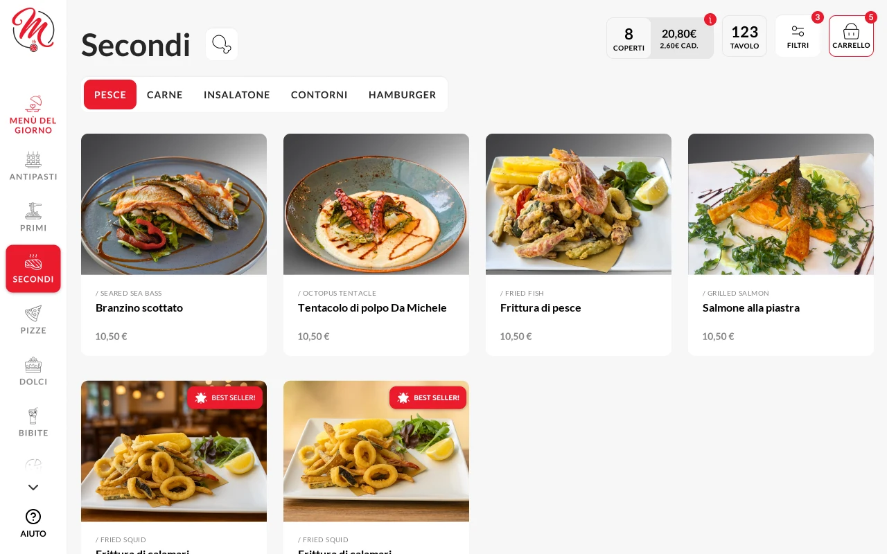
Categories sit in a side bar, each with its own icon. Filters leave only the dishes with the chosen ingredient, or without lactose, gluten and nuts.
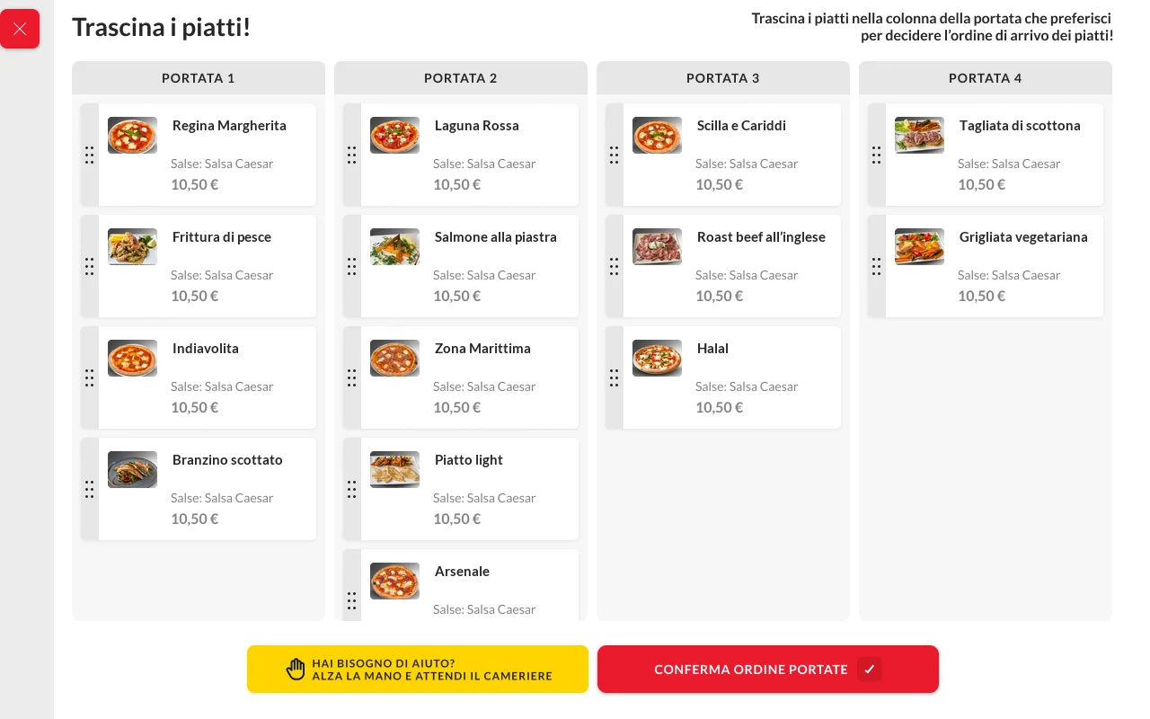
Before sending the order, guests drag each dish into the course it should arrive in, so the kitchen knows what to prepare first and what later.
Guests pay at the table by calling the waiter, or at the till. With a password, staff enter the reserved area to register customers, hide sold-out items, update prices and sync the catalogue.
The red of the logo marks buttons, the active category and best sellers; everything else is white and light grey, so the food photos do the talking. Yellow has one job only: calling the waiter. Lato keeps names and prices readable on a tablet lying on the table.
#eb1a2d#262626#ffd400#f7f7f7#ffffffWe laid out every step in wireframes, one set for the tablet and one for the phone, and reviewed them on calls with the client before designing. Then came the design, the icons and the components with their variants, handed over to the development team.